


User ofer135 asked me about my art process, so I put this together for them! After receiving it, they reccomended me to post it publically, so here it goes! 0v0 Be free to ask questions!
Program: Paint Tool SAI 2 (Will also work for SAI 1 for the most part)
That's a little long, but basically... First, I sketch the pic out... obvs
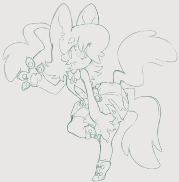
The lines are in a 'Multiply' mode layer!
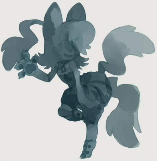
Then, in more 'Multiply' layers, I add tones! I prefer to always keep it unsaturated, since the next step include lots of saturated modes
I add lights and colors with 'Overlay' and 'Screen' layers! In this step sometimes I add different colors, but most of the time I maintain the hue. It's good to start with a single hue!
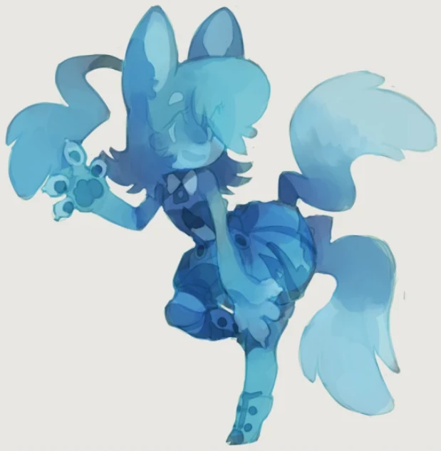
Once I'm more or less satisfied, I add more colors! I add these with a mix of overlays, screens or even 'Color' mode layers.
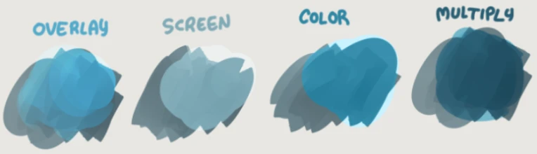
Generally, Overlay is for saturation and color. Screen is for unsaturated lights and contrast, and color is for neutral tintying. If it starts to look too saturated, I can reduce the saturation in any of the layers to compensate. Lowering the luminosity is another valid option.
With the picture more developed, I also might add more Multiply or color layers in order to adjust contrast. I let my intuition guide me
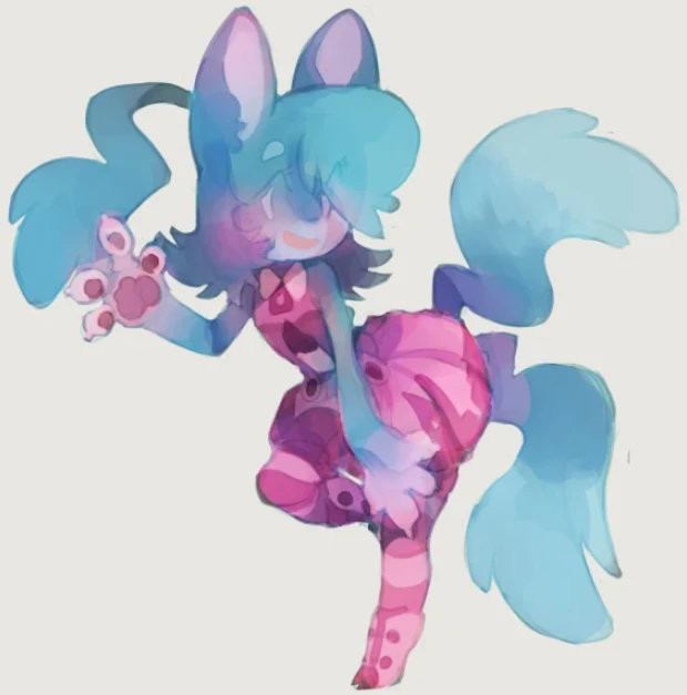
Since the picture has gotten a little messy, sometimes I add a layer where I paint over what I already have using the marker and pickying colors from the image itself
See it's a little more defined? I also add contrast and mix colors as needed.
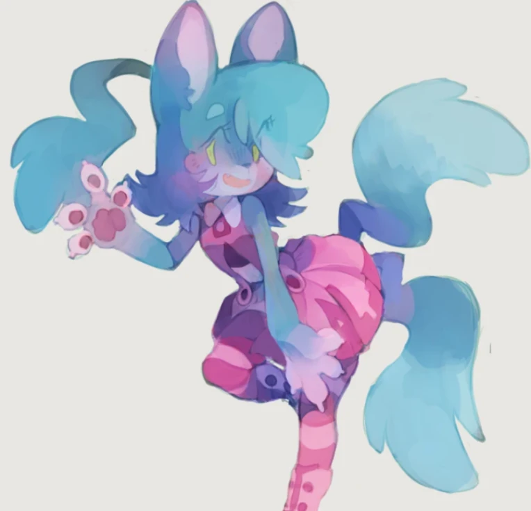
After that, I use a mix of layers as needed to make adjustments so the picture's colors are ready to work! Using filters like upping contrast or depth is also fine!
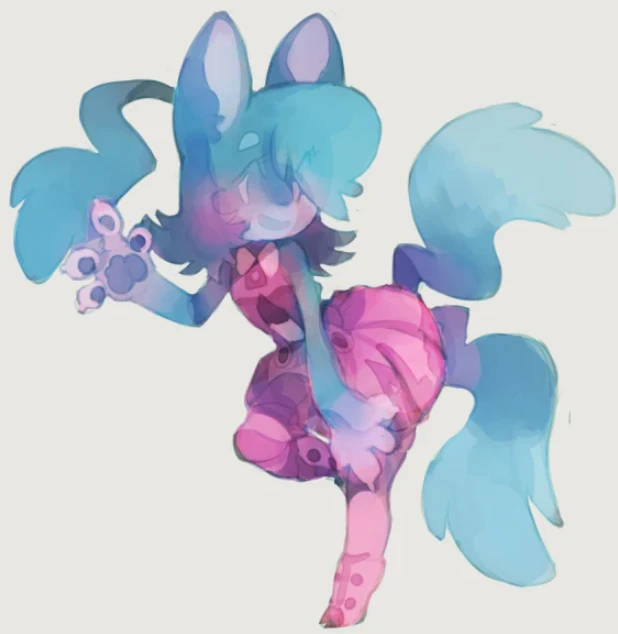
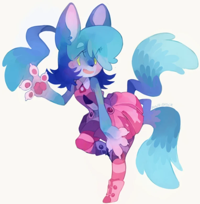
Picture is ready for rendering!
Then, I merge all the layers together! Usually I put them in a folder and duplicate that folder, so I can keep the original layers. It's a big loss of information otherwise ;v;
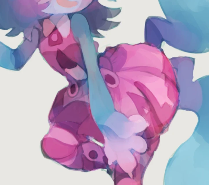
On the merged image, I use a blending brush and start dragging colors, defining shapes and the like. Sometimes (in this picture it's very obvious) I still use extra layers to add more color and contrast where needed~!
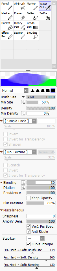
My blending brush is a modified version of the 'Watercolor' default brush in Paint Tool SAI. It's set so it never adds color on its own, but only drags colors that are already on the layer. The dragging becomes more transparent if the pressure is low, allowing me to do gradients here and there. Think of it like when you use your finger to drag pencil on paper, but not messy and you being able to hold the pressure for as long as you want! (Btw do not use your finger to drag colors, it's greasy and will ruin your art)
EhoX
Much appreciated!